

Data first — why a sign can make or break a corner store
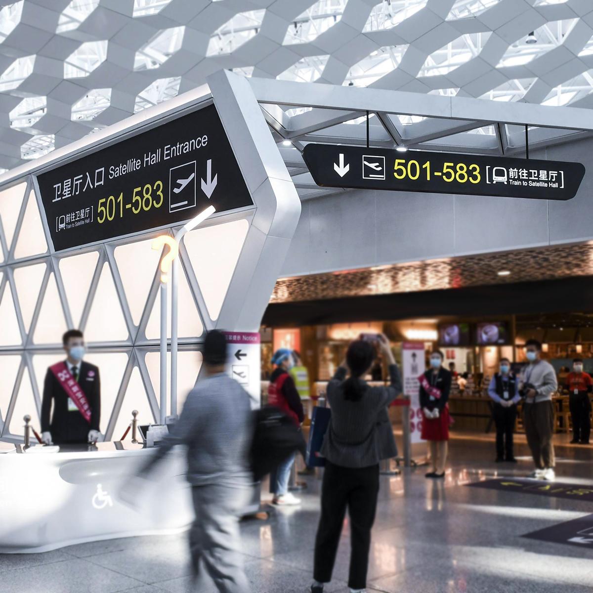
People move fast. At Tokyo’s Shinjuku Station, about 3.5 million trips happen each day — that’s extreme passenger flow and zero patience. Smart placement and clear visuals matter more than ever, so good public transport signage isn’t just civic bling, it’s commerce fuel. This is a data-driven look at how illuminated blade signs change shopper routes, reduce confusion, and nudge conversions.
What “intelligent illuminated blade signs” actually do
Short version: they guide, signal, and convert. Blade signs stick out from façades so you catch them while walking. Add dynamic illumination and micro-programming — timed brightness, color cues, even simple motion — and they become real-time wayfinding tools. Legibility improves. Dwell time drops when people find what they need quickly. Luminance tweaks make messages readable at dusk, noon, and rain. Small tech. Big impact. 🔆
Hard numbers that matter (and how to read them)
Measure conversions like this: baseline foot-traffic, then add blade signs and track uplift over consistent periods. Key metrics are footfall change, conversion rate at the doorway, and average dwell time inside. In busy interchanges where headways are short, a clear blade sign grabs the passing glance and shortens decision time — meaning more entries per minute. Use short A/B runs to avoid seasonal skew. — Don’t run assumptions; test.
Comparing static vs intelligent blade signs
Static signs are cheap and steady. Intelligent blade signs cost more, but they buy behavioral control. Practical differences: dynamic signs can alter brightness for different times, flash directional cues during events, and sync with crowd data. That means fewer missed entrances and higher first-impression click-through — sorry, walk-through — rates. If you’re near a transit node, integrating with local passenger flow feeds pays off. For general projects, check public transportation signage standards so your tech matches local wayfinding conventions.
Common slip-ups and quick fixes
Lots of brands get hung up on fanciness instead of clarity. Top mistakes: too much motion (annoyance), poor contrast (low legibility), and mismatched scale (can’t read from distance). Fixes are simple: prioritize contrast and font weight, set luminance profiles for weather, and size signs for sightlines from 10–30 meters. For safety and compliance, align with municipal signage codes — that avoids rework and fines.
Design checklist — get this right before you install
Keep a short spec list:
– Visibility from approach paths (clear sightlines).
– Readable typography at speed (legibility).
– Adaptive brightness and emergency fallback.
– Maintenance plan for LEDs and mounts.
Also map your sign to commuter rhythms. Morning flows differ from evening flows. Match messaging to peak patterns and you’ll turn fleeting glances into entries.
Three golden rules to evaluate any illuminated blade sign
1) Metric-fit: Choose signs that let you measure. If you can’t track footfall change or dwell time, you’re guessing. Prioritize hardware that supports sensors or integrates with counting systems.
2) Context-readiness: The sign must match local wayfinding norms and daylight conditions. A beautiful display that blinds people at sunset fails the job. Luminance control and contrast are non-negotiable.
3) Operational durability: LEDs, mounts, and controllers should handle rapid passenger environments and variable weather. If maintenance windows are long or replacements costly, ROI disappears fast.
These three rules tie directly into practical value — clearer routes, steady conversions, less downtime — which is exactly the kind of on-street outcome a project needs. For real sites near transit hubs or bus stops, working with experienced partners makes this seamless, and that’s where thoughtful suppliers like Cosun Sign come in. — real solutions, built for motion.